

Hub Pen is one of the best known brand names in the promo industry. Started in 1954 in Boston by Frank and Rita Fleming selling pens door to door, they could hardly have imagined their company would be responsible for shipping 100 million pens a year.
Hub today stands by the same core principles personal service and quality product it stood by over 65 years ago.
Now it is time to reintroduce Hub to the modern world, to keep Hub relevant and to make the brand itself a value-add to our customers.
Exceptional customer service with a personal approach
Industry-leading product quality control
Named after Boston, still shipping from Boston
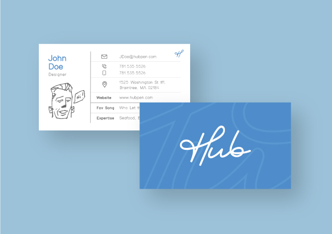
Our new logo is eye-catching, modern, and takes full advantage of our product’s implied motion of handwriting. Optical kerning gives clear legibility to “Hub” while the standalone “H” also provides versatility. A lightweight font and delineated placement in relation to other content makes the logo instantly recognizable.
 Old
Old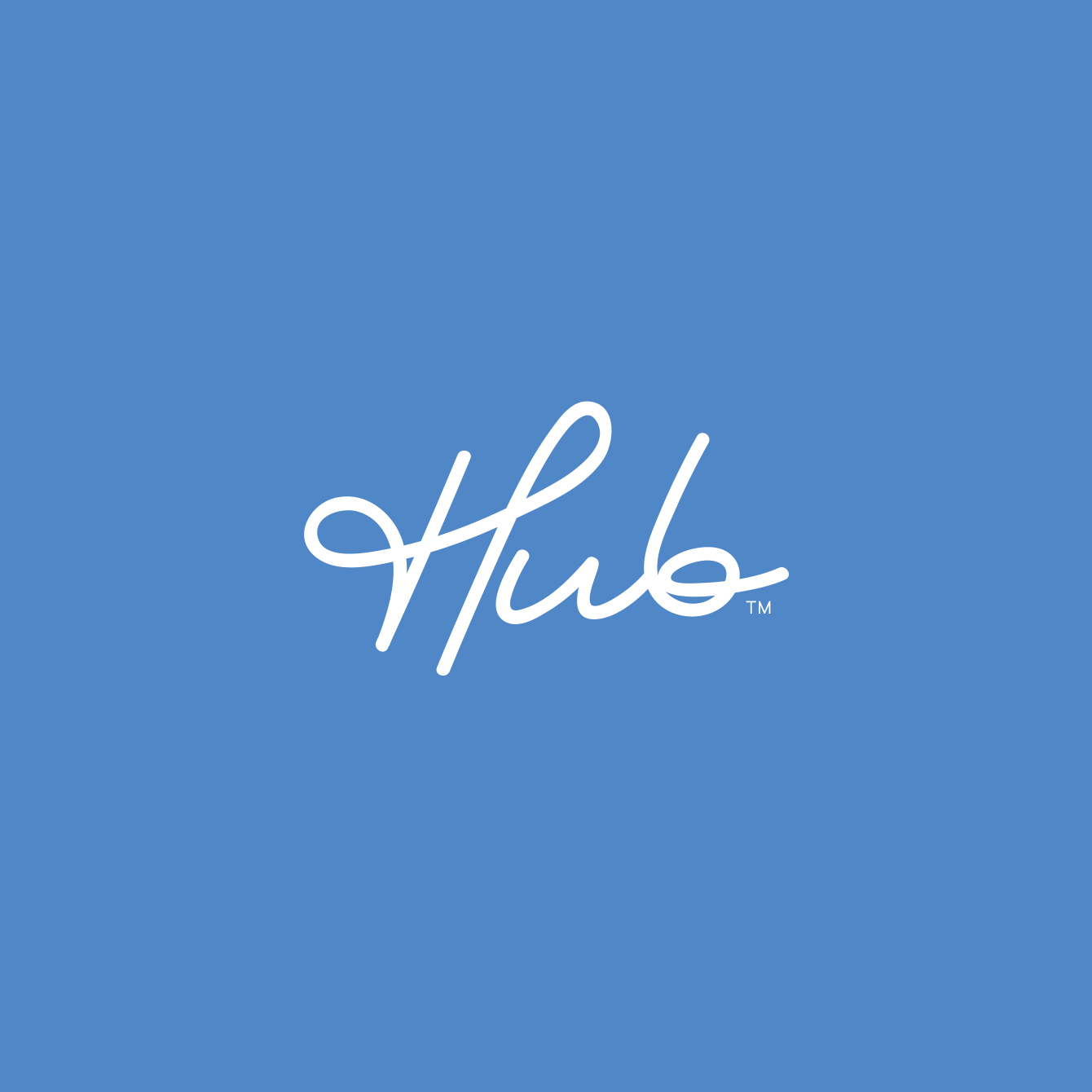 New
NewThe logo should not be altered, modified, separated, or recreated in any way. All logos are EPS (vector) or PNG files with transparent backgrounds. We’ve supplied you with several color options within each link. You do not need to open either file formats in order to use them. Simply place or import the file into your document as you would with any image file.
Download a zip file of EPS logos
Download a zip file of PNG logos
Download a zip file of animated GIF logos

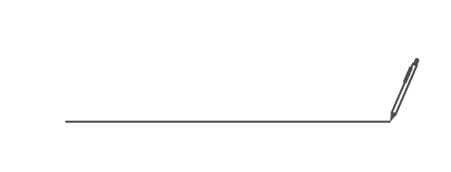
Our product is the connection from human thought to communication. By using cursive animation we reinforce our products value and relevance in a stylish and modern way.
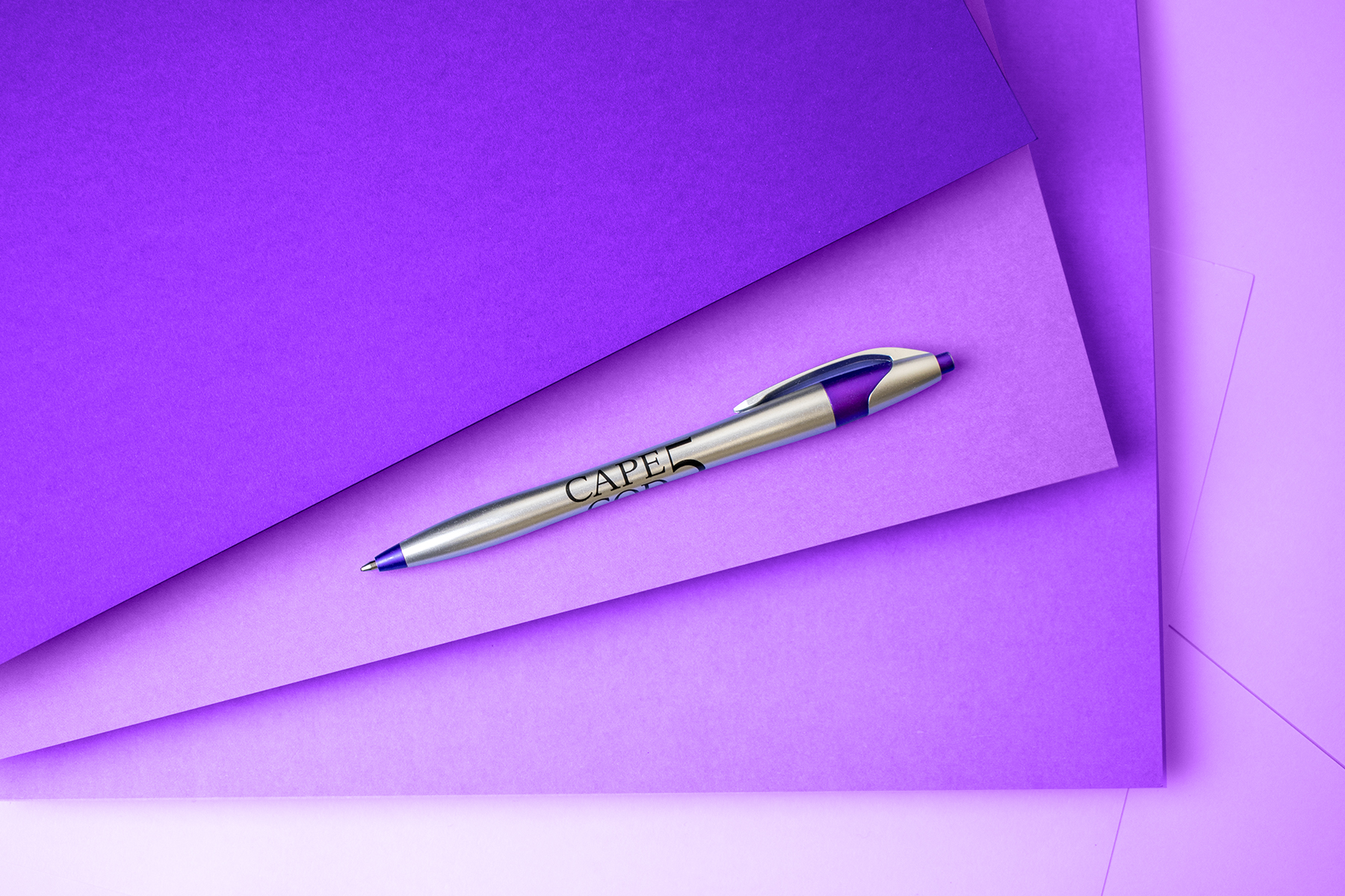
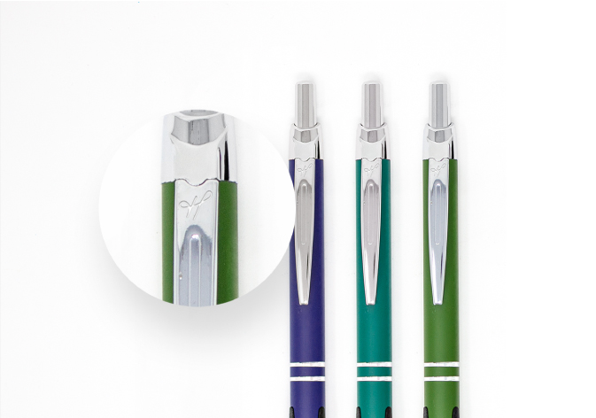
From signing checks to doodling, pens play many roles in everyone’s life. Pens serve as both a utility and vehicle for creative expression.
Our rebrand design system had to address functionality, applications across various formats and creativity. Personality, practicality, affordability and portability.

The abbreviated “H” can standalone while still being recognized.
Download a zip file of EPS logos
Download a zip file of PNG logos
We add character to each employee’s outreach.
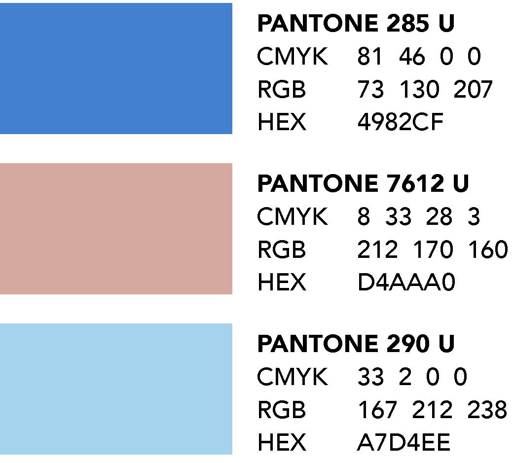
We were inspired by Boston’s traditional hertigage and its proximity to the ocean.
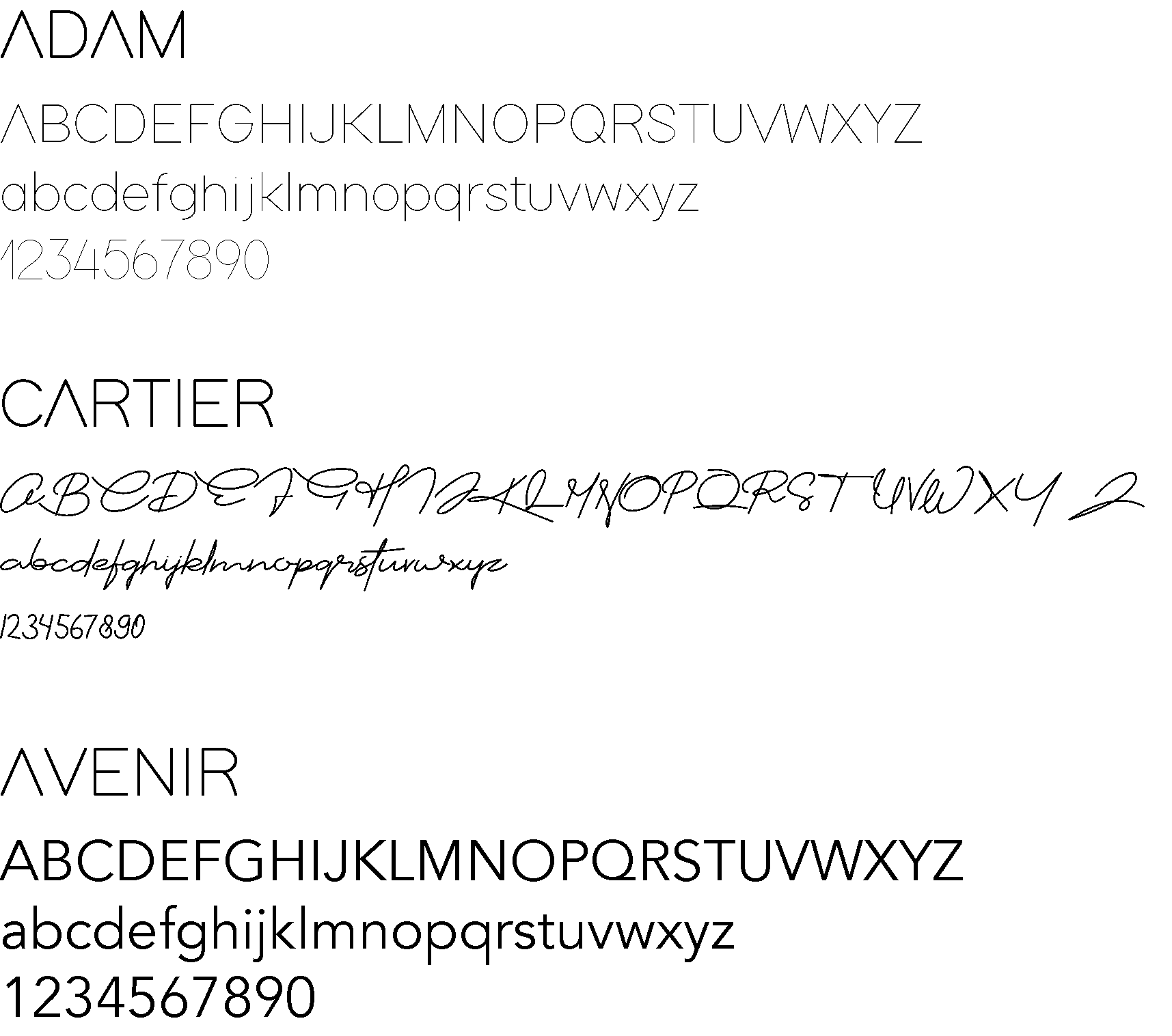
The fonts that were selected are both modern and playful with the Cartier font resembling actual handwriting.
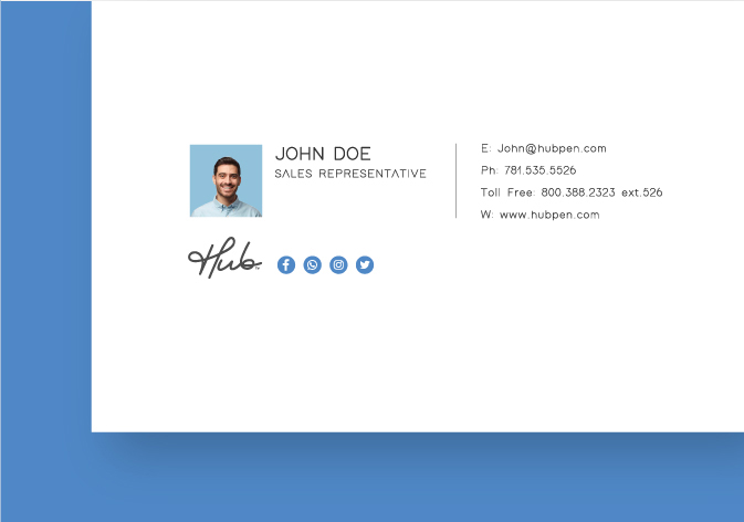
Custom signatures maximize exposure in a digital context.
You can download marketing resources that we’ve created to help build your promotional pen sales.
Social Media Images
Product Images
Marketing Flyers
White Papers